Plugin comparisons often begin with feature tables.
Does Plugin A support more layouts? Does Plugin B have another integration? How many settings are included in the premium version?
Those questions matter, but they overlook something users experience every single day: how the plugin feels to operate.
A plugin can have excellent code and still create unnecessary friction through poor UX.
Admin time is real time
A public website may receive thousands of visitors, but the people maintaining it may also spend hundreds of hours in WordPress every year.
Every confusing label, buried setting and repetitive workflow consumes part of that time.
For agencies managing many sites, the cost multiplies further.
Good plugin UX is therefore not cosmetic. It affects operational efficiency.
Familiarity reduces learning cost
WordPress has established interaction patterns: admin menus, settings tables, notices, buttons, tabs, list tables and editor controls.
Plugins do not need to look identical to Core, but completely reinventing familiar behavior creates a learning burden.
A user should not need to discover a new interface philosophy for every plugin they install.
Consistency helps users transfer knowledge from one screen to another.
Good defaults are part of UX
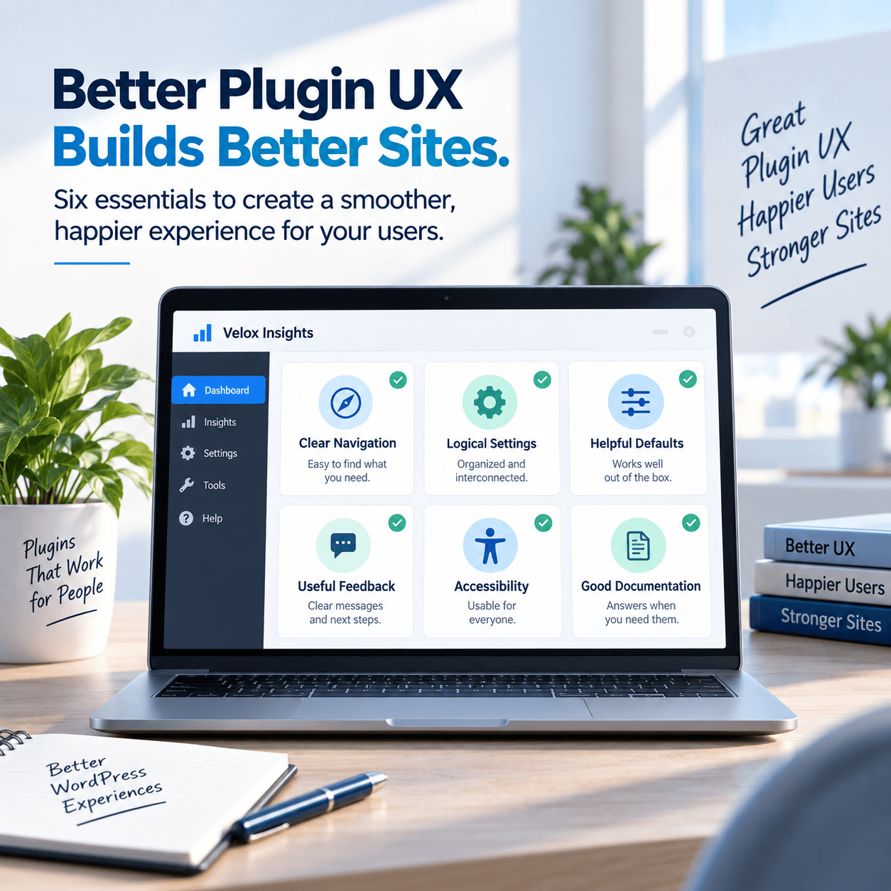
The first experience with a plugin should produce a sensible result without requiring users to understand every advanced option.
That means defaults should be safe, practical and reversible.
Advanced control can still be available, but the interface should not force every user to become an expert before they can complete a basic task.
Progressive disclosure keeps screens manageable
Complex plugins often need many settings. The answer is not necessarily to display all of them at once.
Progressive disclosure shows the most important decisions first and reveals advanced options where they become relevant.
This can be achieved with tabs, expandable sections, conditional settings or separate advanced screens.
The objective is to reduce cognitive load without hiding important functionality.
Error states deserve design attention
A plugin’s happy path is only half of the experience.
What happens when an API key is invalid? When required data is missing? When a service is unavailable? When a user lacks permission?
Good error messages explain:
- what happened
- what the user can do next
- whether any data is at risk
“Something went wrong” is rarely enough.
Accessibility is UX
Keyboard navigation, focus visibility, semantic labels, contrast and screen-reader behavior should be part of interface design from the beginning.
Accessibility improvements often improve usability for everyone. Clear focus states help power users. Better labels reduce ambiguity. Logical heading structure makes complex settings easier to scan.
WordPress itself continues to improve accessibility across editor and admin interfaces, and plugins should move in the same direction.
Responsive admin screens matter now
WordPress is no longer administered only from a desktop monitor.
Site owners approve content on tablets, troubleshoot from laptops and sometimes make urgent changes from phones.
A plugin screen does not need to reproduce every desktop function perfectly on a small display, but it should remain usable. Tables should not simply disappear off-screen. Controls should not overlap. Important actions should remain reachable.
Notices should inform, not compete
Admin notices are useful for errors, setup requirements and genuinely important changes.
They become harmful when used as permanent advertising banners across unrelated screens.
A plugin should respect the user’s workspace. Promotion can have a place without occupying every page of the dashboard.
Destructive actions need safeguards
Deleting data, resetting settings or disconnecting integrations should be explicit.
The interface should communicate consequences before the action occurs and use confirmation appropriately.
Users make fewer mistakes when the UI makes dangerous actions visually and verbally distinct from routine ones.
Documentation should connect to context
A Help link is more useful when it leads to the relevant topic rather than a generic homepage.
Inline explanations, tooltips and contextual documentation reduce support friction while keeping the interface clean.
The best documentation strategy begins inside the workflow and expands outward when the user needs depth.
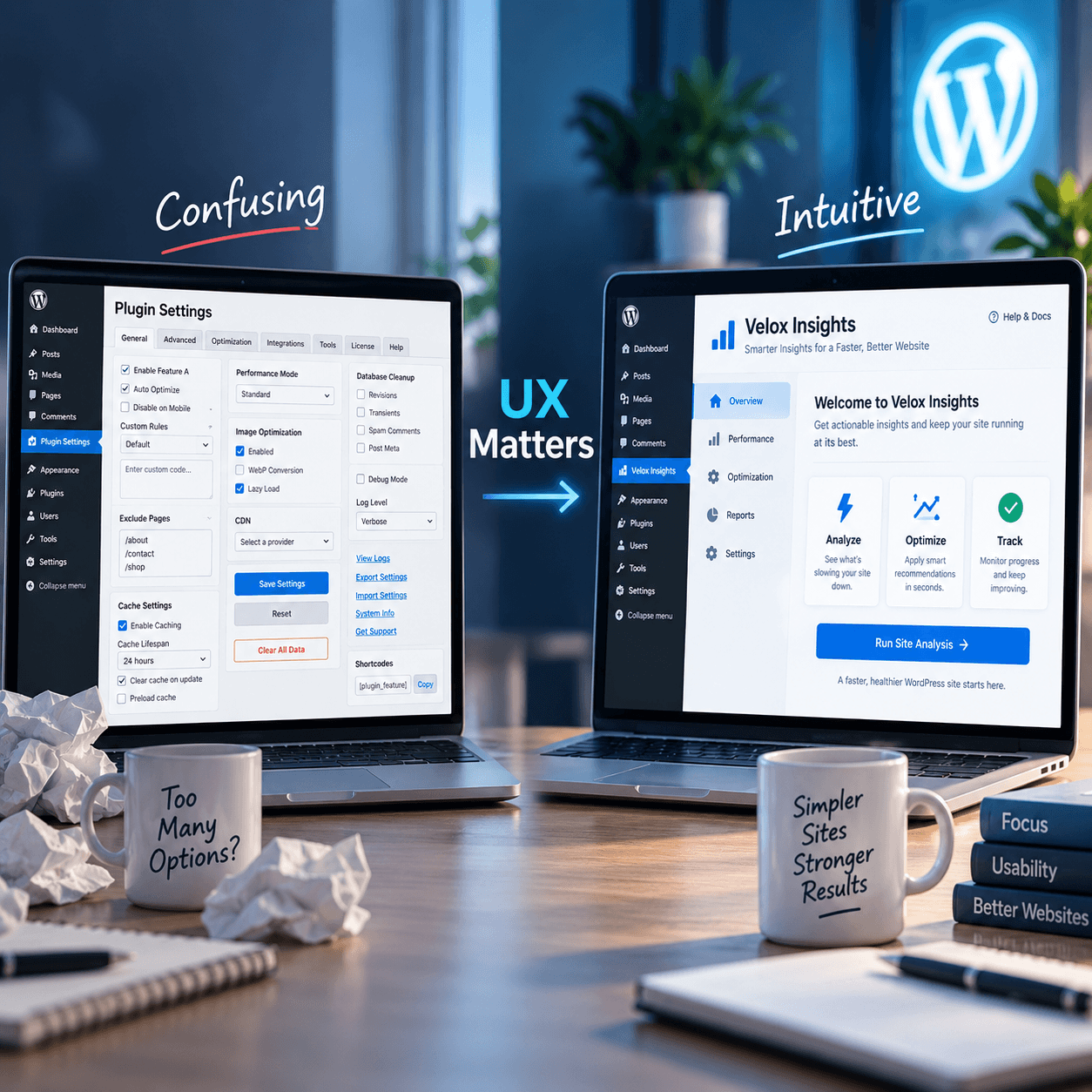
Consistency across a plugin family matters
When a developer publishes multiple plugins, shared visual language becomes a product advantage.
Users can learn once and carry that familiarity across settings screens, notices, help systems and common controls. The ecosystem begins to feel coherent rather than like unrelated products with the same logo.
That consistency should not prevent each plugin from fitting its task. It should create a dependable baseline.
Features win comparisons; UX earns retention
A long feature list may persuade someone to install a plugin. A clear, dependable experience is what makes them comfortable keeping it.
Good plugin UX reduces support requests, prevents mistakes and builds trust in the developer’s decisions.
That is why interface quality should be evaluated with the same seriousness as performance and functionality.
A plugin is not just code that produces an output. It is a tool someone has to use.