

A store locator is easy to underestimate.
At first glance, the feature seems straightforward: put locations on a map and let visitors find the nearest one.
In practice, a locator sits at an important point in the customer journey. The visitor already has intent. They may want to visit a branch, call a dealer, find a service center, check opening hours or get directions.
A good locator removes friction between that intent and the next action.
Start with the user’s actual question
Most visitors do not open a locator because they want to explore a map.
They are asking something like:
- Which branch is closest to me?
- Is there a location in this city?
- Which dealer provides a particular service?
- What is open near my destination?
- How do I get there?
Design the interface around those questions rather than around the map itself.
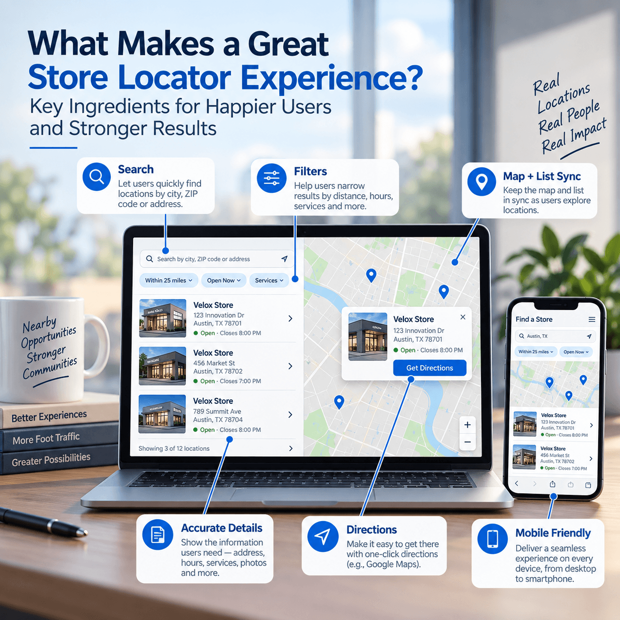
Search should be prominent
A locator without a clear search experience makes users do visual work that software should do for them.
Location search may support city names, postcodes, neighborhoods, addresses or current location depending on the business and available geocoding.
The search field should be obvious and should explain what kind of input it accepts.
Results need a list as well as a map
Pins are useful for spatial understanding, but they are not always the fastest way to compare locations.
A synchronized result list can show information that would be awkward to place directly on the map:
- branch name
- distance
- address
- phone number
- opening status
- services
- directions action
The strongest locator experiences let the list and map reinforce each other.
Selecting a result highlights its marker. Selecting a marker reveals the corresponding result.
Distance should be meaningful
“Nearest” only works if the user’s reference point is clear.
If browser geolocation is used, ask permission at an appropriate moment and provide a manual-search alternative. Visitors may deny location permission or be searching on behalf of someone in a different area.
Distance units should also match the audience. Kilometers may be appropriate in one market, miles in another.
Filters should reflect real business differences
Filters are helpful when locations genuinely vary.
A bank might filter branches by ATM availability or service type. A retailer might distinguish outlets, dealers and service centers. A healthcare network may filter specialties.
Do not add filters simply because the interface supports them. Every filter should answer a meaningful visitor question.
Mobile behavior is critical
Location searches frequently happen on phones while users are already traveling.
Mobile locator UX needs particular attention to:
- tap target size
- visible search controls
- map/list switching
- result-card height
- sticky actions
- directions handoff
- avoiding controls hidden behind browser UI
A desktop-first locator squeezed into a narrow viewport often becomes frustrating precisely where it should be most useful.
Directions should be one tap away
Once a visitor selects a location, the next action should be obvious.
A directions button can hand off the destination to the user’s mapping application. The locator’s job is usually not to replace full turn-by-turn navigation. It is to help users identify the right destination and continue smoothly.
Location data quality matters more than map styling
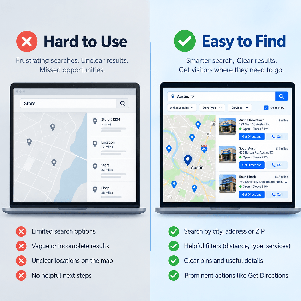
Beautiful pins cannot compensate for incorrect addresses.
Maintain a reliable source of location information and define who owns it. Common data problems include:
- duplicate branches
- outdated phone numbers
- missing coordinates
- inconsistent naming
- old opening hours
- relocated stores still appearing at the previous address
A locator is only as trustworthy as its data.
Empty states should still help
What happens when there are no nearby results?
Do not leave the user with an empty map and no explanation.
Suggest widening the radius, clearing filters or searching another area. If the business supports online service or central contact, provide that path too.
Performance affects conversion
Mapping libraries can be substantial, and large location datasets can become expensive to render.
Good implementations avoid loading more data than the visitor needs. Clustering, lazy initialization, filtered queries and conditional asset loading can keep the interface responsive.
A locator should not make the rest of the website heavy simply because one page uses a map.
Accessibility needs more than map markers
A visual map alone is not sufficient for every user.
Important location information should also exist in accessible text and controls. Search fields need labels. Result lists should work with keyboards. Interactive elements need visible focus states. Information conveyed by marker color should have another cue.
The result list is especially valuable because it provides a non-map path to the same destinations.
Keep the map in service of the task
The strongest locator is rarely the one with the most visual effects.
It is the one that answers a visitor’s question quickly:
Where should I go, and what do I do next?
Everything else — pins, animations, filters and styling — should support that outcome.