

WordPress accessibility discussions often focus on themes and public page content.
That is important, but plugins create a large portion of the interactive web experience: forms, sliders, maps, filters, tables, popups, dashboards and editor controls.
If those interfaces are difficult to use with a keyboard, screen reader or low-vision settings, the website is not accessible simply because the article text is well structured.
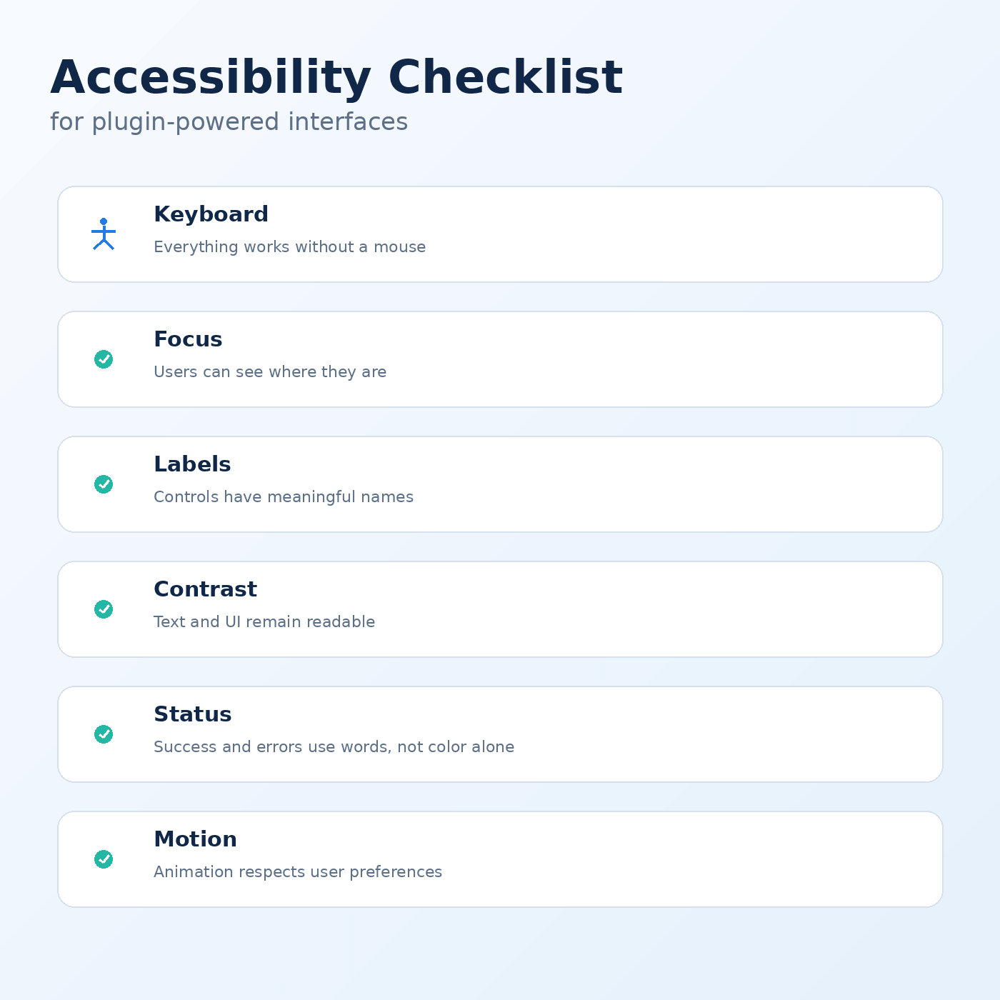
Here is a practical checklist for plugin-powered interfaces.
Use semantic elements first
Choose native HTML controls where they fit the task.
A real <button> already carries keyboard and accessibility behavior that a clickable <div> must recreate manually. A real form label creates a reliable relationship with its input.
ARIA can improve semantics when necessary, but it should not be used to replace straightforward native HTML.
Ensure every control has an accessible name
Icon-only buttons are common in compact interfaces.
A visual trash icon may be obvious to a sighted user, but assistive technology still needs to know that the control means “Delete location.”
Labels should describe the action in context.
The same applies to search fields, dropdowns and custom controls.
Make everything usable by keyboard
A user should be able to reach and operate interactive controls without a mouse.
Test with the Tab, Shift+Tab, Enter, Space and arrow keys where appropriate.
Watch for:
- controls that cannot receive focus
- focus trapped inside a component
- dropdowns that open but cannot be navigated
- modals that send focus behind the overlay
- actions available only on hover
Keyboard testing is one of the fastest ways to reveal weak interaction design.
Keep focus visible
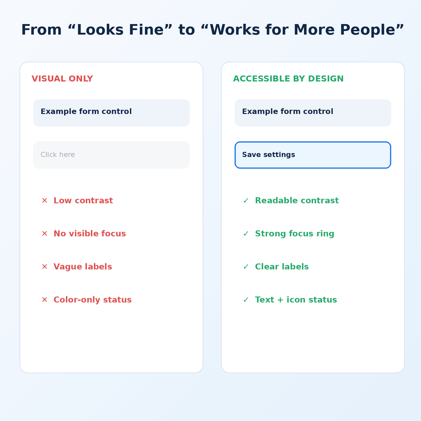
Do not remove focus outlines simply because they do not match the visual design.
Create a focus state that is obvious against the component background and works across light and dark contexts.
A user navigating by keyboard needs to know exactly where the next action will occur.
Do not use color as the only signal
Red and green status colors are common, but color perception varies.
Pair color with text, icons or patterns. A failed validation field might show an error message and icon in addition to a red border.
Map markers representing different categories should have another distinguishable cue where practical.
Check contrast in real states
Contrast problems often appear outside the default state:
- placeholder text
- disabled controls
- hover states
- selected tabs
- small secondary labels
- text over images
- dark-mode variations
Test the complete component, not just the normal text color.
Use a logical heading structure
Plugin documentation and admin screens often contain several nested panels.
Headings should describe hierarchy rather than simply provide visual size. Screen-reader users can navigate headings quickly when the structure is meaningful.
Do not choose heading levels purely for styling.
Announce dynamic changes
Modern plugin interfaces frequently update without reloading the page.
Search results change. Validation messages appear. Items are saved. Filters update a table.
Some of these changes need to be communicated to assistive technology through appropriate live regions or focus management.
A visual spinner alone may not convey enough information.
Make tables genuinely tabular
Administrative plugins often display data grids.
Use proper table semantics when the content is tabular. Associate headers correctly, and do not rely solely on visual column alignment.
Responsive behavior also matters. If a table transforms into cards on mobile, make sure relationships between labels and values remain clear.
Provide alternatives to map-only information
Maps deserve special attention because they are highly visual and interaction-heavy.
If locations are important, provide an accessible list containing the same essential information. Users should be able to search, select a location and access its address without needing to interpret map markers visually.
Validate forms clearly
Error messages should identify both the problem and the affected field.
Do not rely only on a red outline. Move focus appropriately when submission fails, and preserve user-entered information where possible.
Instructions should appear before users make the error when a field has unusual requirements.
Test zoom and text enlargement
Interfaces that work only at a particular viewport and font size are fragile.
Zoom the browser substantially and test increased text size. Controls should not overlap or become unreachable. Horizontal scrolling may be unavoidable in some specialized data views, but core actions should remain usable.
Accessibility improves product quality
These practices benefit more than users with permanent disabilities.
Keyboard support helps power users. Clear error messages help everyone. Strong contrast helps people working in bright environments. Larger touch targets help mobile users. Logical structure helps all readers scan complex screens.
WordPress Core continues to invest in accessibility, including significant work in the 7.x releases. Plugins should treat that as a baseline to build on.
The goal is not to pass a checklist once. It is to make accessibility part of component design, implementation and regression testing.