

In WordPress, the featured image often gets added at the end of the publishing process.
The article is complete, the title is final, SEO fields are written — and then someone searches for a vaguely relevant image so the post does not look empty in the blog grid.
That workflow treats the featured image as decoration.
On a well-designed site, it is much more than that.
One image appears in many contexts
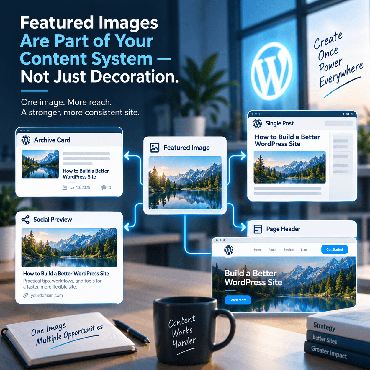
A single featured image may be reused across:
- the blog archive
- category pages
- search results
- related-post modules
- homepage cards
- the article hero
- social sharing previews
- RSS readers
- email newsletters
Each context may crop and scale the image differently.
That makes the featured image part of the site’s content system.
Composition should anticipate cropping
An image that looks excellent at 16:9 may fail when cropped to a square card.
If the subject sits tightly against an edge, a different aspect ratio may cut it off. If text is baked into the image, responsive crops can make the text unreadable or incomplete.
Editorial image design should leave enough visual breathing room for common crops.
When possible, keep critical information out of the pixels and in actual HTML text.
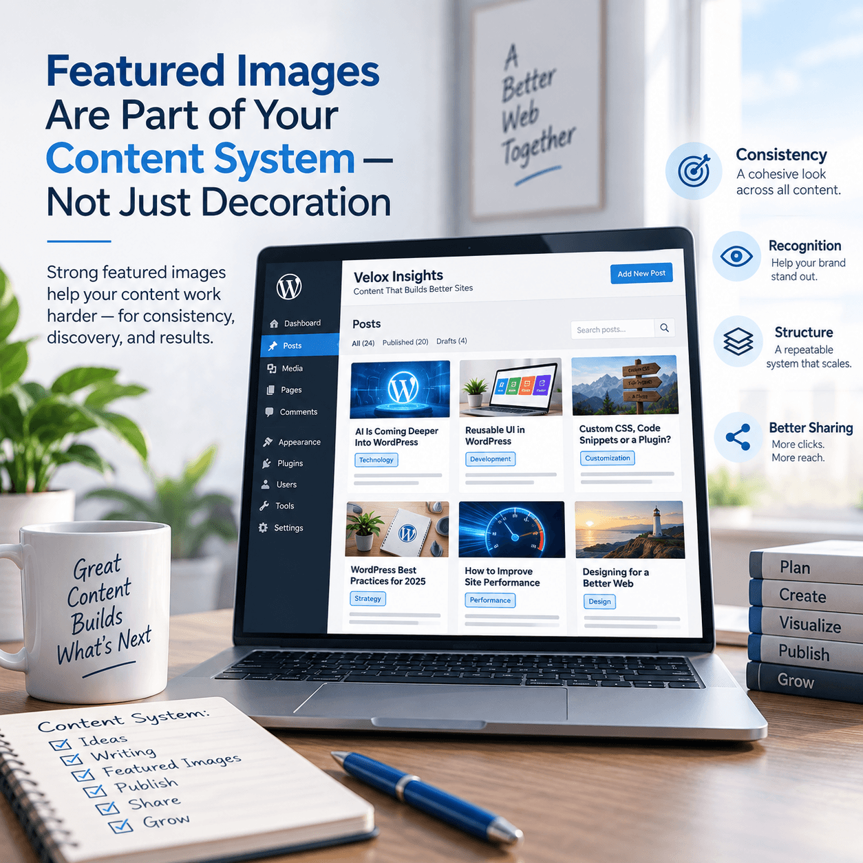
Consistency matters across an archive
Open a strong editorial website and look at its article grid.
The images may be different, but they usually feel related through choices such as:
- color treatment
- photography style
- illustration approach
- lighting
- framing
- graphic overlays
- aspect ratio
This consistency makes the archive feel intentional.
A blog with 30 unrelated stock-image styles can feel less credible even when the written content is strong.
Featured images help users scan
Images are not only aesthetic. They can create category and subject recognition.
A map-related article might use location-oriented visual language. A performance article might use technical diagrams or speed metaphors. A workflow article might use interface-based imagery.
When the visual supports the topic, users can understand an archive faster.
File size still matters
High-quality visuals should not mean unnecessarily heavy pages.
Serve images at appropriate dimensions and use modern compression and responsive image behavior. WordPress already generates multiple image sizes; themes and plugins should request suitable sizes rather than always loading the largest available file.
A polished article grid that downloads dozens of oversized images can damage the experience it is trying to improve.
Alt text should follow the image’s role
Not every featured image needs the same kind of alternative text.
If the image conveys meaningful information not already expressed nearby, useful alt text can describe that information. If it is purely decorative and the article title already provides the context, redundant text may not help.
Accessibility decisions should reflect purpose rather than a mechanical rule that every image must contain a keyword-heavy description.
Social sharing changes the stakes
When a page is shared, social platforms may use the featured image or a dedicated social image from metadata.
If the same visual is used, make sure it remains legible and recognizable in a social preview. Tiny details that look fine on a desktop hero may disappear in a compact feed card.
Where the publishing workflow supports it, dedicated social crops can be worthwhile for major content.
Editorial teams need repeatable rules
A scalable image workflow should answer basic questions:
- What aspect ratio do we design for?
- What minimum resolution is required?
- Can images contain text?
- What visual style fits each content category?
- Who owns image optimization?
- How are image credits handled?
- What naming convention is used?
These rules reduce inconsistency and make production faster.
Defaults and fallbacks are useful
Sometimes an article is imported, published quickly or created before its final artwork is ready.
A sensible fallback system prevents the site layout from breaking or displaying an empty card. A default image can preserve structure, but it should not become a permanent substitute for meaningful editorial visuals.
Think beyond the single post
When choosing a featured image, do not evaluate only the top of the article page.
Open the archive. Check the mobile card. Preview the social share. Look at related posts. Consider what happens when 20 other articles sit beside it.
That broader perspective changes the design question from:
“Does this image look good?”
into:
“Does this image work throughout the content system?”
That is the standard a featured image should meet.